
Yesterday, Microsoft released Windows 11 build 22478 to Windows Insiders in the Dev channel. The headlining feature of the build was that it included brand-new emoji. Specifically, these new emojis had been revealed back in July, and they were said to be coming to all of Microsoft’s products, including Windows 11. As it turns out, the new emoji only kind of came to Windows 11, and users are not happy.
Here’s what happened: When Microsoft announced the new emoji back in July, it write a long blog post explaining everything that went into making them. One of the first things the company highlighted was that the new emojis were 3D instead of the flat 2D designs that the company has always used (the designs have been tweaked over time, but have always been 2D). If you’re anything like me, the prospect of these new, beautiful emojis was exciting, and it lined up perfectly with the new design language for Windows 11.
However, what we got with yesterday’s build was not what we saw back in July. Indeed, all of the emoji in Windows 11 build 22478 are flat 2D images. Essentially, they’re similar to the emoji we saw, but any sign of shading was removed and replaced with flat colors. Here are some comparisons of the emoji we saw in July compared to what’s available to Windows Insiders.
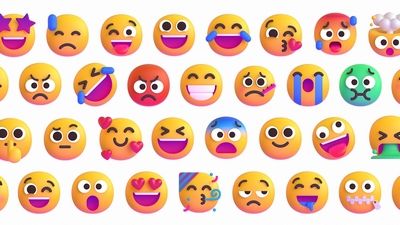
Of course, design is subjective, and 2D emojis aren’t necessarily worse than 3D ones. It’s up to individual preferences, and the issues fans are having aren’t related to that. The problem is that Microsoft clearly promised one thing and delivered another. In fact, even a month after the original blog post, the official Twitter account for Windows mentioned the new 3D emoji as part of Windows 11:
We can’t stop obsessing over these newly designed emojis for #Windows11. Which one is your favorite? pic.twitter.com/vVQapkipbc
— Windows (@Windows) August 20, 2021
To be fair, there may be valid reasons for not including the “3D” shaded versions of the emoji. The shading may affect the visibility of the designs, particularly at smaller sizes, and they may not be as accessible to users with specific vision impairments. But if that were the case, it would make no sense for Microsoft to announce the shaded variants of the emojis to begin with, and to then reinforce that these emojis would be coming to Windows 11, when in fact, they didn’t.
At the end of the day, emojis are somewhat superfluous, and you could say the same thing about any aspect of visual design. However, for many people, good visual design contributes to the overall enjoyment of an experience, as we highlighted in our Windows 11 review. Microsoft hasn’t explained why it chose to go with 2D designs, but it does look like that’s what we’ll be stuck with.
The post Users are not happy with the new Windows 11 emojis, and for good reason appeared first on xda-developers.
from xda-developers https://ift.tt/3G06JmW
via IFTTT
Aucun commentaire:
Enregistrer un commentaire